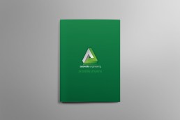
AED Consulting Sydney – Group Branding & Logo Design
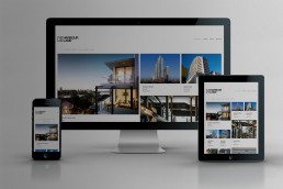
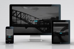
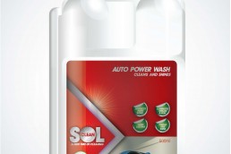
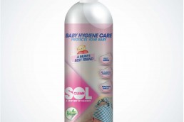
Strong the logo stands out away from everything it touches, the logo reflects the strength and the importance of what they do. And when viewed across other media it really stands on it own, Cleverly designed the Access logo show two arrows in the centre of the “D” this alters when going to the AED fire the “D” Contains a Flame. The Certifying logo has a tick mark in the “D”. As you would expect it bonds together seamlessly. Wowwee Design the Sydney Design Agency created a series of logo design to help AED consulting to help with the development of their expanding business. We also created a new responsive website design which is viewable across any device. Since designing their logo. We have design many different forms of collateral, including brochures, site signs, high vis branded clothes, stationary & business cards. AED group used the three symbols of so the various department could be easily distinguishable for their clients. We have many more exciting projects in the pipeline, don’t for get to check back soon for more.
About AED
AED Group is a leading consulting/engineering firm with a broad range of experience. The group of companies have a long standing reputation for integrity, professionalism and excellence. We provide a comprehensive range of services to our clients, including: the management process. We have a strong reputation. This is reflected in the level of repeat business and the long term relationships we maintain with our clients. Click here to visit the AED Group Website